Saturday, December 08, 2007

Stadiums for the community??

Just a thought came to my mind as I read through a sports news article titled "Seedorf's SOS for soccer". In the article, Seedorf, a famous soccer player for Netherlands who was born in S. Africa, spoke of solving the issues of sports violence and players' welfare through the design of stadiums. As of now, there are increasing incidents of violence from the spectators stands and in some cases, the police are the ones getting hurt.

Here's a quote from him,
<<
At Milan's Champions League 1-1 draw at Benfica's ultra-modern Stadium of Light last week, Seedorf saw where Italy had gone wrong and that new grounds attract calmer fans.

'In Lisbon, it was a great stadium, very public-friendly. Simple things make a difference,' he said. 'That's what we need in Italy. We need to build new stadiums. Outside of Italy, people are addressing these issues.' >> published 07 dec 2007, The Electric New Paper, Sports


image from www.wayfaring.info/tag/soccer/


image from www.nytimes.com

It's an interesting observation and I just want to point this out, given the recent hype about the sports hub designs in Singapore. Maybe we can explore new ways, new typologies of looking at sporting facilities' designs.

What are the implications of future sports arenas, facilities? Can stadiums do more for the community? What new architecture discourses can be derived by the changing sporting experience?


Wednesday, November 14, 2007

While we're at it...

...there's also the Alvar Aalto exhibition, by the Alvar Aalto foundation and NUS Museums, on-going at the National University Museum (that's at the University Cultural Centre),


...and T3 (no Kristianna Loken though (or Arnie depending on who you like); the closest you get to cyborgs are perhaps the smiling SQ girls) which is open to the public during office hours and weekends for the public.

(Images from rightful owners)


Check here for more details! (A little bit of input required.)

Exhibition and Public Lecture - Neues Bauen - New Architecture

Every so often, we architects / architecture-enthusiasts need something to remind us why we even sold our souls - and for some of us, even our (social) lives! - to the Underworld. (Literally, for times when we do things like design basement carparks.)

Here's one of those things - an exhibition (with a keynote lecture) on "New Building"! (Neues Bauen in German. The latter word rhymes with "Frauen", except it doesn't quite mean the same thing. ... Now, if there were a lecture on Neues Frauen.......)

It's based on a 1927 exhibition, International Plan and Model Exhibition of New Architecture, that placed architecture in an international context. That exhibition toured 17 European cities between 1928 and 1930 as a part of Die Wohnung (Habitation), a 1927 Werkbund exhibition in Stuttgart, demonstrating the similarities and interdependence between the modern buildings from the US and Europe. (This paragraph adapted from publicity material)

Perhaps the throwback to 1920s architecture ideas - highly innovative at that point in time; still in vogue 80 years on (which can't be said of any 80-year-old Frauen!) would stir up enough nostalgia for us to get re-inspired should our motivation run dry, reliving the little wow moments amidst the snoozes in first-year architecture history courses.

On a side note, if the 1920s was "new", pre-WW2 "modern", post-WW2 (very loosely) "post-modern", the decades straddling the turn of the new millennium "contemporary", wouldn't we have run out of terms to define movements in art, architecture and philosophy say, 80 years downstream?

Anyhow, the exhibition runs from today til 6 January, with a keynote lecture this evening! ...

"Neues Bauen. What was so new about it in 1927?"

By Professor Karin Kirsch
Moderated by Dr Erwin Viray
7 to 830pm
Gallery Theatre, National Museum of Singapore
Free admission

In conjunction with the Neues Bauen (New Architecture) exhibition, now til 6 Jan 2008; 10am to 9pm


(Image taken from the National Museum of Singapore website, hence the funny tags.)

Please see http://www.nationalmuseum.sg/ for further details.

Tuesday, November 13, 2007

A Good Start to Something New

We just finished the Design My Place (Urban Creativity Workshop) over the weekend. It was nothing short of an amazing experience for the students, the facilitators, the organisers, and our supporters. It was very encouraging to see at the end how well received it was not just by the students, but also by our sponsors from URA, our supporters from Design Singapore and other guests that we invited as part of the jury panel.

Our greatest thanks and appreciation certainly goes to Khoo Peng Beng, our Chief Facilitator/ instructor/ teacher/ Akido instructor, without whom, the whole workshop would have been less energetic, less inspiring, less passionate and less successful. More on the workshop in the next few days. For now, enjoy some pictures.

Saturday, November 10, 2007

BLDGBLOG: Architectural Weaponry: An Interview with Mark Wigley


BLDGBLOG: Architectural Weaponry: An Interview with Mark Wigley
: "BLDGBLOG: It’s interesting, then, to note that all of the construction going on today, from Dubai to Beijing to midtown Manhattan, is specifically referred to as the building boom – not the architecture boom. There’s a huge difference there. To what extent, then, are we surrounded by more architecture than ever – or less architecture than ever before?

Wigley: I’m really tempted to say it’s less. You can have a building boom and it will actually be an architecture deficit. So architecture can be in decline at a moment of massive building. I think that would be a fantastic subject for debate."

BLDGBLOG: Architectural Weaponry: An Interview with Mark Wigley

BLDGBLOG: Architectural Weaponry: An Interview with Mark Wigley:

"BLDGBLOG: To some extent it seems like the lack of agitation in today’s architectural discussions comes from the format those discussions occur within. In other words, you get five people who already know each other and you put them on a panel; they then talk about something they’ve already talked about before – and, two hours later, nothing’s happened. So it would seem that, if we really want to introduce turbulence into architecture, as you say, then we need to structure our conversations differently, to explore new formats. If that is the case, what formats lie beyond the seminar, the lecture, the panel discussion, etc.?

Wigley: It’s a great question. I don’t think Marshall McLuhan can go far wrong – the medium/message thing. I mean, what you’re saying is: does the medium, the technology, of education and communication in our field limit the kind of things that we can say? And the answer is absolutely yes.


One of the primary roles to be played by the experimental activists in architecture is not to come up with new ideas of what architecture should be, but to come up with new ways to talk about it – new media. In that sense it’s absolutely crucial that we foster new techniques of communication – with all of the incredible care and precision that we use to foster new forms of design. We need equal care and equal attention to incubate new forms of communication. For instance, if a student project gets to be really interesting, but then we just dump it into the typical format of a magazine, or a monograph, then it can never do what it is really able to do. If we work with a bad medium, you know, it’s all bad.

Saturday, November 03, 2007

Really Tuckshop

Last night's design sharing was a blast in more ways than one! For one, we had to blast our voices over the mike so that everyone could hear us. It's tough trying to share amidst a crowd of hungry packers more interested in their calamari rings and crumb coated chickens. I felt like I was back in the classrooms of one of the sec schools I used to teach at as SH tried his best to get the attention of the audience yet trying hard not to sound offensive.

"EXCUSE ME. CAN I HAVE YOUR ATTENTION PLEASE!" (in a loud voice).

"Sorry, sorry..." (sounding desperately apologetic suddenly).

"The presentation is starting so we would appreciate it if we could have your cooperation. Err.. Sorry to disturb your dinner, sorry sorry!" (In his head thinking: rats, why everyone so noisy... should have brought a loud gong to get their attention. Perhaps I could do an impromptu lion dance?!)

Ha ha, so I digress. In summary, the presentations were rather interesting. We had Dean sharing about some small projects in Jakarta; Sern Hong sharing his thesis project - the pirated city (no, not the pirated cd); Raymond redefining play for us; and Hsia Pin giving us his take on the anti-monument, which was based on the scenerio that if our beloved MM were to pass on, what kind of memorial would be fitting for him. I bet Hsia Pin went home a little worried that night. I remember him jumping ever so slightly each time his phone rang after the presentation. I thought I saw some bright red dots flying around, but then again, it could have just been the alcohol, or the fact that Mr Marshmallow Man was messing with my brain! (see pics later.)

Hsia Pin was sporting enough to bring his band down to play a short gig for us after the presentations. Achor's Door, fronted by Adrian (who didn't have an encore song) entertained us with songs from Lifehouse, Steven Curtis Chapman and the Smallville soundtrack.

Overall, we had a pretty good turnout today. It would have been great if there was a way of getting some discussion and interaction going between the presenters and the audience. But then again, who were we kidding fighting with the hungry growls of the dinner-time monster. Still, it was an interesting experiment and we thank God for Dean and his team who didn't mind us intruding that night. I pray we didn't scare away any of your regular customers!

Incidentally, I noticed that TUCKSHOP supports the Ice Cream Chefs! I liked the way you put it on your menu - "Because like us, they put in lots of love and passion into what they are doing." (paraphrased) That summed up the night for me. It didn't really matter much that the night was more of a blast than we could expect or plan for. What mattered was the spirit behind the whole sharing session - a gathering of passionate people coming together to make something meaningful happen. And that, I must say, produced the most beautiful symphony. Enjoy the pics.

More on Ice Cream Chefs here.


More pics soon.

Monday, October 29, 2007

Nov re:act Design Sharing Session

Clear your calendars this Friday as re:act will be having its November Design Sharing Session at a really cool location called TUCK SHOP! If you are in Singapore, are interested in what some of our young and very talented designers/architects are doing, come and join us for a time of great food, great music, and great sharing.

We start at 7pm and will end before 10pm. Details are in the poster above and you can click on the image for a larger version which you can also download and spam to all your friends! Yes, we would like you to invite any of your friends who might be interested! The more the merrier!

Oh yeah, and I guess it doesn't hurt to give a short plug in of this place, TUCKSHOP since they have so generously welcomed us to their premises! Dean Zhou, one of the owners of TUCKSHOP, and also an architect himself will be helming the decks together with this partner Kaye on sax after 10pm in their weekly Friday session called SOULFOOD. We have 1 photo of the place below and also a map of how to get there. SEE YOU THERE!


Picture and map from TUCKSHOP website.

Saturday, October 20, 2007

OPEN ARCHITECTURE NETWORK CHALLENGE

Competition by Architecture for Humanity

Challenge: To design a sustainable multi-purpose technology facility for under-served communities

Submission Deadline: 01/15/2008

Open To: All. Design professionals and non-professionals alike are invited to compete to develop the winning technology center design. Student entries welcomed.

Entry Fee: $25 per site before 12/15/2007; $30 after 12/16/2007; $0 for entries from developing nations. Group rates available for faculty and students.

Site Awards: The top entry for each site will be awarded one third of the proceeds from all competition entry fees.

Challenge Award: The winning design team will have the opportunity to work on site with the community partner and Architecture for Humanity to build their design.

Monday, October 15, 2007

Friday, October 12, 2007

A classic moment with Cesar

Today was one of those few days in a year when Cesar (Pelli) graced our New York office with his charming presence and infectious laugh. In the midst of our design review with him, a classic moment took place.

We were meditating on a question of how to articulate the top of an office tower we were designing (as requested by Department of City Planning). Amidst all the sketches and models of different iterations, Cesar thought aloud, “Maybe, it just needs something to sit on top of the building.”

He then proceeded to squeeze and crush a paper cup, and then he placed it on top of the study model I made. I just thought it such a classic moment that I had to share it with others.


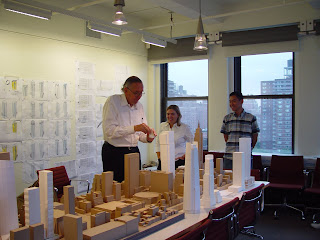
Cesar proceeds to crush the cup, as Ronald and colleague Kristen watch on amusedly........


Cesar examines the "object" sitting on the tower... and chuckles...

As he squeezed the cup, my mind ran through his account of how Eero Saarinen flattened a grapefruit to describe to his employees his ideal form of the TWA Terminal Buiding. And then my mind rushed on the Simpsons episode with Frank Gehry and his crushed paper.

Gehry's epiphany on The Simpsons


May more of such fun and classic moments greet me in my long career ahead. Hooray to classic moments!

UOB Plaza article - my response (Part 2)

And here is my email response to the article in the previous post on Tange's UOB Plaza.


Dear Calvin,

I wanted you to know that your column on the UOB Plaza was an engaging read that yielded some surprising discoveries that I would not have realized had you not brought it up. I can discern the massing of the old octagon tower in the lower UOB Tower now, hidden beneath the tiles!

A few critical questions persist, nevertheless, with regard to the UOB Plaza and I was disappointed to find that your column did not address them sufficiently. While I give the architects benefit of the doubt that their design was tailored to the specificity of the site, the context, the client and the brief, one cannot ignore the formal geometric similarities between the UOB Tower and the Tokyo Metropolitan City Hall completed a few years earlier.

Tokyo City Hall

This leads rise to the perception, rightly or wrongly, that the UOB Plaza is not an original signature, but a replicate cousin of the original. This, despite the beauty of the final product. A similar example would be Cesar Pelli’s acclaimed World Financial Centre in New York and his subsequent Canary Wharf Tower in London, with all their formal similarities…. even though the outcomes were still tailored differently to their respective contexts.

This observation alone perhaps explains why I find myself preferring the OUB Centre to the UOB Plaza. It just feels more fresh and dynamic.

The other connection that I was surprised your article did not pick up, (though I may not be 100% right about this point) is that Kenzo Tange was the masterplanning consultant for Singapore’s skyline – chief of which was the “layering” effect of placing the shorter buildings in front, and taller buildings behind (as viewed from the waterfront). What coincidence that he designs two of the three “prized” trophies within his own skyline tapestry!


Deyan Sudjic, in his recent book Edifice Complex wrote about “collect(ing) images of the rich and powerful, leaning over architectural models….” as evidence of the relationship between architecture and power. On the website of Kenzo Tange Associates (and also printed in a past issue of Singapore Architect magazine, in an article by Tsuto Sakamoto), there is a black-and-white image of Kenzo Tange alongside Lee Kuan Yew in front of a model.

The issue of Kenzo Tange building in Singapore is clearly much more than Tange’s own architectural vision in isolation. I believe that he happened to fit squarely with LKY’s [the REAL architect of Singapore] autocratic vision for a technocratic, cosmopolitan, modern city-state.

When you raise the example of Bawadi’s advertisement (which I have yet to see) where the UOB Plaza rubs shoulders against Petronas Towers, I fear that it is not because it “stands for the best of Singapore and its architecture” or is even iconic enough of Singapore’s urbanscape. It was probably chosen more because it fell within the iconography of the following formula:
grand-skyscraper = developed+cosmopolitan = $$$+ prestige.

Oddly enough, people describe Singapore’s “signature” skyline with reference to “Manhattan” with a strange kind of pride. (Our city planners, foreign journalists, travel journalists, etc). Few realize the irony that when they do so, the merit goes to Manhattan, not to Singapore.

I rest my case for now, and look forward to your next article.

Best Regards
Ronald Lim

UOB Plaza - Straits Times article (Part 1)

Most of you know by now my staunch support for informed commentary on architecture in the Singapore’s mainstream press. I just realised that this article on Kenzo Tange’s UOB plaza was published in the Straits Times a few days back. It was definitely a pleasant surprise.

As a next step, I look forward to seeing more in-your-face criticisms and critical questions being raised, instead of just an explanation of why-this-building-is-so-great. This article is nevertheless a wonderful step in the right direction. I will post my personal response the next post. Enjoy.

Twists and turns of UOB Plaza -
by Calvin Low


The process of constructing the building's iconic rotated motif led to an unexpected discovery about its original design

WHEN the Dubai developer of Bawadi, billed as the 'largest hospitality and leisure development in the world', put out full-page advertisements worldwide to draw investors last year, it borrowed one of Singapore's architectural icons for its pitch.

In the artist's impression of the mega-proposal, Singapore's UOB Plaza rose majestically in the night sky, as resplendently lit as you would see it when you walk down the side of the Singapore River.

Only, in this ad, it rubs shoulders with other montaged international landmarks such as Malaysia's Petronas Towers.

Clearly, Bawadi's developers wanted to attract the best in the world and, in its eyes, the UOB Plaza stands for the best of Singapore and its architecture.

A trait of classic architecture is its ability to remain timeless in its appeal - a result of balancing between seizing an inspired idea and honing it until it reveals its most essential expression.

The UOB Plaza, designed by the late Pritzker Prize laureate Kenzo Tange in collaboration with Architects 61, exemplifies this balance.

It demonstrates Tange's genius in reconciling a pre-existing design with his own architectural vision.

The octagonal form of the towers is derived from the original 38-storey UOB Building by pioneer architect Lim Chong Keat of Architects Team 3, completed in 1974.

Instead of demolishing the original eight-sided tower, Tange followed up on its sculptural promise with a literal twist by adding more floors that are turned 45 degrees to the original geometry, thus giving the building's iconic rotated tower motif.

An additional unexpected situation, however, awaited the architects when re-cladding the original tower as Kenzo Tange's son, Paul, revealed in an interview last year.

It was discovered that the old building had been constructed with a slight, irregular twist along its height. This required fine-tuning the size of the supports of the new cladding panels to take up the geometric imperfection.

Today, most people would not associate UOB Plaza, completed in 1992, with a 33-year-old development. But look closely at the lower of the twin towers and the shape of Lim's original octagonal scheme is still clearly discernable, albeit dressed in grey granite instead of its original copper-tinted reflective glass.

Once the rotating architectural motif had been established with the original tower, it was applied to the design of its taller twin, which rises to the maximum aviation-regulated height of 280m. At 66 storeys, UOB Plaza joins Republic Plaza, by Kisho Kurokawa, and OUB Centre, also by Tange, as the three tallest buildings in Singapore.

A testament to the perseverance required in the creation of this prismatic paragon, the twin-tower scheme for UOB Plaza took 10 years to hone and involved, according to Paul Tange, 'about 100 different schemes'.

UOB Plaza's urban design is also exemplary. Sited between two historic nodes - Raffles Place and Boat Quay - a typical 'max out the ground floor' approach would have eliminated any connection between the two.

Instead, UOB opened about a quarter of the prime ground-floor area to the public in the form of a 'city room'. Flanked by its banking hall, the four-storey, sky-lit 'city room' is both a physical and visual bridge between Raffles Place and the Singapore River. That a constant flow of pedestrians passes through here at all times of the day and night is evidence of its civic importance.

Other public amenities in UOB Plaza include a mosque in the basement and an observation deck on the 42nd storey which offered mesmerising views of Singapore before access to the space was restricted.

From the ground, however, in sunshine or by moonlight when its chiselled charm is enhanced with architectural lighting, the UOB Plaza's twin towers will continue to be of allure long after flashy new icon-wannabes have become victims of architectural fashion.

Calvin Low is a writer who is trained in both architecture and journalism.

Monday, October 01, 2007

The Purpose of Details 2


Click image to enlarge.

Event details:

The Purpose of Details 2: The Malaysian Architectural Scene Through the Works of Three Practitioners
6 October, Saturday, 930 am at the Singapore Polytechnic Auditorium
Speakers: Lillian Tay, John Ding, Wooi Lok Kuang

Complimentary entry for all.

Should be pretty good; last year's was!


Asymptote...


...and their latest, the Penang Global City Centre. Pretty awesome, even if it seems rather no-holds-barred in its curving and torquing and faceting - such nice proportions and, well, (quite literally) asymptotic towers. I could perhaps be a little more critical and go, ah, purely stylistic, an abstraction of Madam White Snake's two dearest pets perhaps, doesn't seem to take Penangite 'character' into account, or a four-way Calatrava / Libeskind / Hadid / Diller-Scofidio hybrid, but this has really won me over head over heels.


Images above (click to enlarge) are courtesy of World Architecture News, and a further writeup on the project can be found here. A quick scan:

"The design achieves its elegance and stature through the simultaneous embrace of
natural landscapes and contemporary urbanism. The PGCC will become a vital new
precinct that complements and enhances the unique characteristics that typify
Penang as a remarkable island metropolis. The design of the iconic towers in
particular draws inspiration from not only the lushness and drama of the
surrounding mountains and seascapes, but also from the rich and diverse cultural
heritage that makes up the Malaysian nation and Penang in particular."

I'm not sure how exactly it draws from the "Malaysian heritage", but perhaps it could be a critique on collective Malaysian psyche and politics - that one tower's an abstraction of the 'bumis', and the other (better-feng-shui'ed one, maybe?) symbolises the Chinese, and that, given that they're asymptotic, never the twain shalt meet!

(That was just a joke and a light-hearted observation on the state of things slightly up North, not by any means a comparison or loaded remark!)

Tuesday, September 25, 2007

Monday, September 24, 2007

My Wishlist for Architecture in Singapore

1) Creation of a Department of Architecture and Design in the Singapore Art Museum (Or alternatively, a museum of architecture and design)
The department would be the guardian of Singapore’s design heritage, would be a home for a permanent collection of design drawings, documents etc related to Singapore architecture, and would provide dynamic and critical curatorial direction to affect critical discourse. (I’m thinking along the lines of how exhibitions like Henry Russell Hitchcock’s 1932 “International Style exhibition” , Paolo Portoghesi’s 1980 “Presence of the Past” or Mark Wiggley’s 1989 “Deconstructivism” left a profound impact on the movement of architectural discourse. ) Exhibitions on Singapore Architecture need to be more than just “showcasing Singapore’s design to the world” at fancy international biennales.


2) A permanent architecture column in the Straits Times, with a qualified resident or rotating architectural critic
I mentioned this in a previous post. If Singapore is serious about the development of architecture, we must also be serious enough to devote space in our print media to educate the public on the role and place of architecture in society and why good/critical architecture matters and what makes compelling architecture.


3) An annual speculative architecture competition for a temporary architecture installation/pavilion that goes up for 3 months each year.

I was thinking of something along the lines of MoMA’s annual PS1 competition that temporarily transforms their space in Queens every summer with a winning installation. It is often a rite-of-passage for up-and-coming architects before they “make it big”. It could alternatively take the form of a commission for temporary follies like the yearly Serpentine Pavilion or Kumamoto Prefecture’s Artpolis project.


4) Creation of a National Trust Fund for Historic Preservation (possibly a tax-free endowment fund) that will heavily fund or subsidise the acquisition, repair, maintenance, and adaptation buildings of heritage value that cannot withstand the onslaught of the free market and developmental pressures independently.
We all witnessed the controversy of the Butterfly House and the we-have-no-choice-but-to-tear-this-down-for-development lame argument. Singapore cannot rely on URA alone to safeguard our heritage because their ultimate responsibility is to focus on development. (note that R in URA stands for Redevelopment)

If any emotionally valuable piece of architectural heritage cannot stand up to the test of the free market, then it deserves a subsidy that is commensurate with its heritage value / design merit (that is often never factored in when people tear stuff down to rebuild and redevelop)

(As a loosely parallel example, Central Park in New York was restored after decades of degeneration with private money by way of the Central Parks Conservancy, independent of municipal authorities)

5) A set of incentives to encourage developers/clients to commit to innovative architecture. (e.g. a tax rebate on rent earned for every project that passes the scrutiny of a design jury, or that wins the President’s design award, etc)

Alternatively, we can tax ugly insensitive buildings. Like the Supreme Court. (just kidding) I prefer carrots to sticks.


But otherwise, I think URA and Design Singapore are coming up with a fascinating slew of initiatives. I only wish their intentions were more pure than "making Singapore a design hub of the world". ..... *sigh*

Sunday, September 23, 2007

The Clients - our allies

Sometime back, Sy Lyng posted an article on the need for architectural “mediators” in Singapore. If I remember the gist of her posting correctly, she referred to such architecture mediators as people who were not career architects, but were important facilitators who took a sincere interest in enabling good architecture to be built.

Along the same vein, I wanted to devote this post to a special category of people who are not the architects but are as crucial to a project’s success. Without these people, many masterpieces and imaginative forms would not have been realized – they are the clients, or the crucial decision-makers in the commissioning process.

Whereas most architects believe that the ideal client gives the architect the free rein, I beg to differ, somewhat. The most successful commissions often begin clients who have a strong vision and intention of what outcome they want. They share with architects the faith in the power of architecture. The strength of their vision and intention often gives clarity to the parameters (and meaningful constraints) that they lay down for their architects. At the same time, they trust the architects to be their own.

Rarely are they followers seeking to commission a building similar in form to something that already exists somewhere else. Instead, they believe in that which has yet to come into existence and make discoveries together with the architects during the design process. In short, they care about the design of the buildings they commission but never usurp the role of designer.

Beyond all these, the strongest architect-client partnerships depend upon a deep affinity, chemistry, and mutual understanding in a highly personal relationship.

For architecture in Singapore to flourish, it is not only important for us to nurture design talent, but to cultivate interest within potential allies within the power circles (in real-estate, in decision-making processes, in academia, in administration) to share the belief in compelling architecture and powerful spaces. The architects cannot go it alone.

I raise here, examples of important people who made it happen because they had a vision and cared about design.


1. Hilla Rebay
Was the curator of Solomon Guggenheim’s personal collection of “non-objective art” She sought to exhibit his collection in a “temple of non-objectivity” and found that the only architect with whom she could share that vision was Frank Lloyd Wright.
The result: Solomon R Guggenheim Museum, New York


2. Jonas Salk
Envisioned a research space for scientists where “anyone with a mind in the humanities, in science, or in art could contribute to the mental environment of research leading to discoveries in science.” He wanted a space where a scientist could “invite Picasso”.
The result: the Salk Institute, (Louis Kahn)


3. Phyllis Lambert
Daughter of Samuel Bronfman, CEO of Seagram. When it was decided that a tower would be built to house Seagram’s headquarters, Phyllis Lambert personally insisted that a great architect be commissioned for the building. She ended up choosing Mies van der Rohe for his most successful skyscraper tower – the Seagram Building.


4. Deborah Jacobs
Head Librarian for the Seattle Public Library. Together with architects Rem Koolhaas and Joshua Prince-Ramus, visited every new library in America, consulted IT experts on the future of the printed book, to clarify the vision of the library of the 21st century.


5. Francois Mitterand
Francois Mitterrand initiated the French government’s decision to fund and build contemporary, audacious and sometimes controversial buildings to reaffirm France’s cultural leadership in the world. The spectacular result includes I.M. Pei’s Louvre extension glass pyramid, Jean Nouvel’s Institut du Monde Arabe, Bernard Tschumi’s Parc de la Vilette, Christian de Portzamparc’s Cite de Musique, Otto von Spreckleson’s Grande Arche de la Defense,


6. Zhang Xin
CEO of Beijing-based real estate firm SOHO China. As a bold personal initiative, she gathered 12 leading East Asian architects (including Singapore’s Tan Kay Ngee) to each design a villa by the Great Wall in a unique commission that has been compared to the historically important Weissenhof Siedlung housing exposition of the 1930s. For her efforts, she became the first non-architect to win a prize at the Vennice Biennale.


7. Simon Cheong
CEO of Singapore-based developer, SC Global. His commitment to high-quality design (in view of his target market of the high-end residential sector of single professionals) led him to commission signature residential projects, including Chan Soo Khian’s Lincoln Modern and Mok Wei Wei’s Three Three Robin.

(I know it sounds slightly lame, but I had to force in a Singapore example to give ourselves some optimism, much as I find it hard to personally buy into the “commodification of design” phenomena)