Monday, January 29, 2007

A tale of two shophouse back-alleys

Chinatown back-alley


Little India back alley

Here are snapshots of two shophouse back alleys I took during one of my vacations back. The former is soldierly clean, brightly painted, yet cold and lifelessly sterile. The latter is slightly disordered, somewhat grubby, yet teeming with soul and urban life. (Dare I say, the latter is more value-added since it involves economic transactions, rental payment, performance of service at affordable prices. And add the intangible value of urban interaction/activity.)

What are the lessons on preservation that we can learn from such a comparison? Is it enough to "sensitively restore" a building to its "former glory" in a clean and pristine state? Are we missing out on something more essential and soulful in our preservation efforts, in our need to talk real-estate re-rental/redevelopment dollars and sense? Could we and should we just leave some areas alone? (as they say, "If it ain't broke, don't fix it.")

What are your thoughts? (Let's start a discussion thread in the comments section.)


Sunday, January 28, 2007

One foreign architect in Singapore

Of the many foreign architects that have bestowed Singapore with mediocrity, I thought that one particular architect didn't do too badly - Paul Rudolph, the influential dean of Yale School of Architecture in the heady 1960s who personally taught a generation of architects that included Norman Foster, Richard Rogers, and Robert Stern.

Paul Rudolph, standing against the textured wall
of his Yale School of Architecture building.

Rudolph's controversial Yale School of Architecture renovation marked the demise of brutal modernism, and the advent of what came after-- post-modernism. When the prevailing mood of denied him of commissions in the West, Singapore (and Hong Kong and Jakarta) gave his high modernism a chance to materialise. Today, Paul Rudolph's late work in Southeast Asia is considered to be his most mature. I am posting pictures here of his significant imprints on Singapore's urbanscape.

The Colonnade, Singapore


Perspective drawing drawn in pencil


The Concourse, Singapore


Perspective drawing of an earlier iteration of the Concourse.
(from the MoMA, New York drawing collection)
Click on photo to enlarge


The Art Institute of Chicago recorded the oral history of Paul Rudolph and interviewed him in 1986 regarding his late work in SE Asia, especially in Singapore. In his interview, Paul Rudolph offers a lot of comments on his experience of building in Singapore, as well as his issues with Singapore's building code/by-laws. A pdf transcript of this interview can be obtained at this site. It is definitely a compelling read.


Singapore 2019: state of architecture pt.1

This is the first in a new series of 2 or 3 posts that will hopefully fire up our imagination. Most of us have come together wanting to question the establishment and find alternate ways to achieve compelling architecture through alternate processes. Much as it is easy for us to comment/criticise the less-than-desire aspects of Singapore’s architecture scene, a big question still looms – what is our desired end result?

With this question in mind, I thought it would not be a bad idea to fictitiously visualise a scenario on Singapore’s architecture scene in 2019, the year of Singapore’s bi-centennial (from the perspective of a major architectural publication). It is also far enough into the future, but near enough for us to be able to impact it. This project may hopefully fire our imagination over the Singapore we desire for 2019. So here goes.


Ten years ago this month, Moshe Safdie’s monumental casino complex opened to the aesthetic chagrin of the city’s inhabitants, bearing its oppressive presence on Singapore’s waterfront. As if to add insult to injury, Michael Graves’ gaudy resort opened soon after, thereby knocking the last nail into the coffin of post-modern architecture. If anything, many were angry that post-modernism’s tomb had to vandalise the view of Singapore’s habour and not some other city’s. Other local inhabitants with less aesthetic inclinations bemoaned Singapore’s damaged fengshui-scape.

fengshui vandalism 10 years ago, back in 2009

That was an era when Singapore’s urban architecture carried both the hits and the misses. The insecurity complexes of a city-state then on the tip of cultural maturation erroneously inspired the mindless outsourcing of imagination to brand-name celebrity architects for an icon that would project that elusive “identity.” (like the gadzillion cities jumping on Bilbao’s bandwagon) Whereas many cities picked the forward-looking ones to advance the cause of architecture, Singapore picked the outdated ones.

Thankfully for the balances of yin and yang, such aesthetic failure bore the seed of equivalent success in the work of locally-rooted practices. The decade witnessed a slew of critically imaginative works by Singapore practices engaging in a local architectural dialogue. These projects included a spectacular subway station roofed with a glass reflecting pool, a cosmopolite’s re-interpretation of the mosque, a biomorphically ephemeral youth activities centre, as well as an imaginative arts school campus bathed in vegetation.

A critical re-interpretation of the Mosque
at the dawn of the new Millenium

Ten years on, today in 2019, architectural Singapore is buzzing confidently like never before. If a mere breeze of change passed through Singapore ten years ago, the breeze has since intensified into a torrential storm. In the line-up are a slew of imaginative private and public projects, driven by an increasing willingness to speculate on new ideas. Ranging in cost and scale, many of these projects were the result of a confluence between new directions in architectural patronage and a bottom-up activism spearheaded by creative agents in the local scene, thereby effecting an “ideas revolution” in architecture.

New speculative directions: the result of
an "ideas revolution" in architecture

The annual “Archi-Follies” competition for a 6-month long temporary installation at the Clementi Town Centre is, by now, a closely watched event by architectural critics and curators for new trends and directions. The “Urban Tree-Houses for Civil Society” initiative has also given many Singapore NGOs a uniquely urban presence – on the grand rain trees that line Singapore’s Orchard Road. The first tree-houses for the NGOs Singaporeans for Democracy and People Like Us opened four years ago to much public fanfare.

Singapore’s architectural buzz is, no doubt, a cultural reflection of the flowering of democratic pluralism in this city state, spurred by a newfound willingness to question prevailing ideology. The recently convened “What is Singapore?” project, organised for the run-up to Singapore’s bi-centennial celebrations, is the clearest testament so far of this new courage to question.


NGOs and the advent of democratic pluralism...


...and Singapore's architectural answer

Carrying epic proportions, the month-long symposium gathered local and regional, politicians, theorists, academics, global thinkers, creative practitioners as well as Singaporeans from all walks of life to critically investigate the void at the heart of this national/urban construct of Singapore. On a heroic scale never seen before, the energy generated by this symposium will polemically impact Singapore’s cultural discourse and production.

On the occasion of her bicentennial, the Global Architecture Review is proud to celebrate Singapore’s dynamic diversity in this month’s issue. We feature ten recent works of architecture that imaginatively express the city-state.

"The Melting Tower" urban speculation
by RL.


1) Centre for Singlish Research

2) Pelangi Centre for Sexual Diversity

3) Vertical Creative Community Project (Public Housing Adaptive Re-use)

4) W Party Headquarters

5) The Inter-faith Spiritual Cavern

6) Tree House X

7) Sri Mariamanammam Hindhu Temple

8) Bukit Bintu Hawker Centre

9) National Human Rights memorial

10) Singapore Architectural Museum

(To be continued in Part 2)


Urban Tokyo Series - pt.2: Showa Modern

This week, our Tokyo correspondent Darryl Wee gives us his take on Showa Modern, the genre of architecture that emerged in a culturally insecure Japan during the Taisho-Showa era and eventually blossomed into the Japanese modernism that we know of today.

Although never formally colonized, Japan has always been fertile nesting territory for Western cultural imports. The vogue for youkan (western houses) dates from Meiji, but it was only really during early Showa (1925 onward) that modernist architecture as such began to sink roots. Ever since Frank Lloyd Wright’s Imperial Hotel was completed in 1923, Tokyo has cherished, if not actively fetishized, the industrial gleam of steel and glass, prizing their “negative” values like natural light and void space.

Frank Lloyd Wright's Tokyo Imperial Hotel, 1922

Maybe that affinity was mirrored in its own native building traditions: the one storey hiraya, a wooden house constructed from timber joinery and sliding screens; the row house (nagaya) stretching deep into narrow back alleys (rojiura) despite an extremely narrow frontage (supposedly a legacy from feudal times when merchants, for whom this dwelling was principally constructed, were taxed on their property according to the width of this frontage along the main thoroughfare); the tea room, or sukiya, that opens out onto a “verandah” overhanging the garden or doma (unfloored part of the house), the site of domestic urban-pastoral happiness, it seems - frothy matcha in tea bowls with Japanese sweets, sunning oneself while playing go, entertaining the house cat, etc.

Foreign architects working in Tokyo found warm reception for their open plan, well-lit interiors. Conversely, Japanese repatriate architects returned to plant Parisian arcades and brick buildings all over the city. Wright’s assistant on the Imperial Hotel, the Czech-born Antonin Raymond, enjoys something of a mythic status as a pioneer of rational, angular modernism. In suburban Suginami ward, Raymond’s Tokyo Women’s Christian University nestles next to Zenpukuji park. The church façade is riddled with geometric ventiblocks that resemble a Moorish arabesque, or one of Wright’s Mayan-inspired suburban stone villas in Hollywood or Pasadena.

Early attempts at reproducing a Bauhaus aesthetic
in Japan (Kikkawa Residence by Horiguchi Sutemi, 1930)

The record of Japanese product during the same period, however, was patchy. Mainstream Japanese modern before the war was essentially Bauhaus inspired-and-imitated. Apartment blocks were initially meant only for foreigners and Japanese repatriates. It introduced other curious and forward-looking youngsters, mobo and moga (modern boys and girls; essentially the Japanese generational equivalent of London’s Bright Young Things, or Fitzgerald’s Jazz Age dandies) to dosoku seikatsu – literally, life with shoes on. From wood, cinderblocks and rice paper, lounging on cushions and tatami, suddenly Tokyo’s moboga were capering around a living room in brogues and heels, perching on top of Bauhaus pipe chairs and sipping earl grey from English china.

The love of “modern” interiors was uncritical and unchallenged, and at first the Japanese didn’t so much import Western architectural expertise as borrow the glamor of its associations. The defining curves and stylized lines of New York Art Deco were props on permanent loan for the living spaces of Asia’s first burgeoning middle class urban consumer society.

European mod cons seemed as if they were flown in direct and retrofitted. From Paris, the shopping arcades or passages suddenly materialized in central Tokyo. The first indoor arcade appeared in the Maru office building in 1923, in the Marunouchi/Hibiya district, historically faithful down to the mosaic floors, Art Nouveau arches and wrought iron rails and balustrades. This would mark the start of an enduring taste for Reform Club smoking-jacket chic: heavy lampshades, thick wooden panelling and so on. Even today, this sort of gentleman's club atmosphere lingers in the more sullen corners and musty basements of Marunouchi and Ginza, still cherished by retro hounds with a taste for boardroom gravitas.

Japanese Pavilion at Paris World Exposition
by Sakakura Junzo, 1937

It would take some time for modernism as such to be fully digested by the New Japanese architecture, though. Maekawa Kunio, together with Sakakura Junzo and Yoshimura Junzo, completed the somewhat textbook-Miesian International Culture House (kokusai bunka kaikan, not to be confused with the late 50s concrete concert and event hall in Ueno park called just bunka kaikan) in Roppongi, which even way back in 1923 already had the stirrings of a foreigner-friendly cosmopolitanism. Late in his career, Maekawa would find the balance that would earn him his reputation as a leading light of the New Japanese Modern, successfully marrying his Bauhaus leanings with traditional “authentic” Japanese traditions.

Maekawa Kunio's Tokyo Metropolitan
Festival Hall, Ueno, Tokyo, 1961

His personal residence (1942), now dismantled and reincarnated in the open-air Edo-Tokyo architectural museum in Koganei city, is essentially a hiraya with more generous proportions and better natural light. It retains the free flow of space from the interior living room outward to the yard of the traditional Japanese residence, with an elegant concession to high ceilings and near-transparent sliding screen doors. The result is one of those rare instances where fusion rids each component of its limitations. The Japanese house managed to shed its usual gloom, and the modern glass box acquired a newfound warmth of materials. I’ll let the picture speak for itself

the Maekawa residence: its warmth and glow

Tuesday, January 23, 2007

Pedagogy in Liberal Arts Colleges – Ronald’s Response pt.3

I just wanted to thank Joshua and Hann for their encouragement and instigation. Otherwise, this third instalment would not have appeared so quickly. I’m not sure how to go about this instalment…but will try my best. For a start, I think this post is more relevant in relating how I grew as a person, not so much how I grew as an “architect.” (although the two are not mutually exclusive.)

As mentioned in my 2 previous posts, what I studied outside my major (Studio Art) covered up to (or possibly more than) 60% of my coursework at Wesleyan, and mattered as much to my education. During my time on campus, apart from Studio Art, I took classes in Japanese, Japanese literature (in translation), Psychology, Architectural History, Art History, Dance, Government, Economics, English, Sociology, Astronomy, Music, Mathematics, Classical Studies, etc.

The initial years spent at Wesleyan were just for me to figure out what I wanted to major in, since I actually liked quite a lot of stuff. Initially, I wanted to major in an inter-disciplinary social studies program (not unlike Politics,Philosophy&Econ at Oxford). Then I thought I would double major in Econ and something else I would potentially like, like East Asian Studies. (Econ to play safe, in true Asian style) Then I thought maybe Econ and Studio Art. And then I ditched Econ.

Oddly enough, I don’t remember the specifics of what I learnt in many classes. Some of the classes were hits (i.e. I learned so much from them), and some were misses (i.e. totally not what I expected, and totally did not enjoy. Like Astronomy). What endured however was a thirst for knowledge and thoughtful opinions. The more I learnt, the more I realise how little I knew. I spent time sifting the library for random stuff to read, like Francis Seow’s “To Catch a Tartar: a Dissident in Lee Kuan Yew’s Prison,” or just knowledge in other fields personally related to me. (architecture, history & politics of Singapore, cultural studies stuff, etc) I only knew of the true extent of Singapore’s ugly side after I came here.

A few aspects of my educational experience were special. To begin with, there was no “box”. Most people talk about having to think “out of the box”, but I realised that when I was exposed to the critical/analytical modes of so many possible disciplines, I was not stuck in any approach of analysing an issue but free to borrow analytical methods from whichever discipline I wanted. Such freedom can be disconcerting at times. The only constant was the written word, in linking sentences, paragraphs, reasons, arguments. I finally came to realise why reading and writing is so important- for testing and exploring ideas, for crafting arguments, for expressing opinions.

Next, were my classmates. Every one had their own voice and their own opinions on issues related pertaining to the discussions in class. Some were logical, some were faulty. But I realise that it was when all the ideas were out there, interacting with other ideas, that a greater level of awareness would be reached. I also realised that the act of speaking out itself, and overcoming the fear that my idea may be not be good enough, raised me to a new level of awareness. (Maybe it’s because when you let an idea that is stuck in your head get out there, new ideas and observations flow in.) Most thankfully, I was free from a world of right answers vs. wrong answers. We inhabited the world of questions and opinions.

I felt fortunate to be amongst many thoughtful individuals who were on different paths to different places. (e.g. a Government major now working for an NGO, Art History major who is now a primary school teacher, an English major who is now a Tibetan Buddhism academic, research assistant at World Jewish Congress, biologist etc etc) We spent a lot of time discussing personally meaningful issues (the war, the world, personal aspirations, life, etc) outside the classroom, on dinner tables, on the field under the autumn leaves. We often agreed to disagree. That made a difference.

Same for most of you, teachers also make a great difference. Surprisingly, I did not cultivate that many close-knit relationships with all my professors. But there were the few who made a very big difference in the way I saw the world. Architectural historian Joe Siry was one. My studio instructors, Barrett and Martha were two others. Outside architecture, I grew intellectually/analytically under my classes with Sociology Professor, Jonathan Cutler, and linguistically under Takahashi-sensei. (though I would lose my Japanese all too quickly.)

The Latin root word for “education” is “educo”, which means to draw forth from within. In that sense, what I literally learnt from my classes did not matter as much as the personal insights I gained, the voice I found and the person I became. I think what my Wesleyan education fired up in me was a passion and desire: to learn, to know, to be, to live. Perhaps you may understand now why the professional/technical aspects of architecture still do not matter to me as much as its underlying meaning.

I realise that this raw desire motivates me in great ways and gives me my voice and my thought, so that I can pursue my architecture, and life for all its richness. This is just a personal hypothesis, but I believe that a strong personal voice is a pre-requisite for truly compelling architecture. And this personal voice can only grow stronger when fed with desire, and knowledge.

PS// Joshua: I hope this account made a difference.


Monday, January 22, 2007

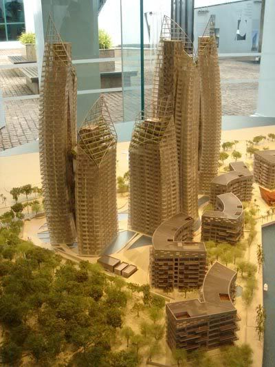
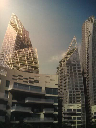
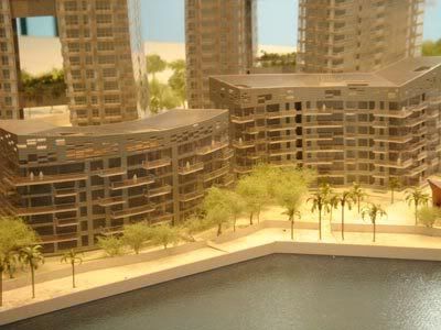
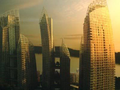
Reflections at Keppel

Something pilfered off a friend's blog (with his kind permission, of course ;)), Cheng Hui Chua, 1st year, architecture grad school at Yale.


(Images taken by Cheng Hui from the on-going exhibition at the Singapore Art Museum.)

The Art of Architecture

This article was published in Business Times on 20 Jan 2007. I thought it was an interesting insight into the motivations and aspirations of a world-reknown architect whose first building was built only when he was 54! It inspired me in certain ways, to push on in what I believe architecture is to me, perhaps it might bring some encouragement to you too!


Daniel Libeskind tells PARVATHI NAYAR why he regards architecture as 'the mother of the arts'

WHEN Berlin's Jewish Museum finally open
ed in 2001, its startling zigzag form, zinc exteriors, and dramatic interplay of solids and voids attracted vast public interest and generous critical plaudits. There were 200,000 visitors in the first two months alone. It was a great success that made the architect's name, but the really interesting details are that it was the architect's first building and that he was already 54 years old.

'He was a late bloomer,' says Nina Libeskind about her superstar architect husband.

Architecture isn't a profession of quick returns. 'An architect is a marathon runner not a sprinter,' chuckles Daniel Libeskind, who was in town to launch the exhibition Between, Beside, Beyond at the Singapore Art Museum which features 16 of his key works, and to launch the condo he is building for Keppel Land, called Reflections At Keppel Bay.

'Many run out of breath and drop out,' he says, continuing the marathon metaphor, 'but those who know how to time themselves can reach a goal - which is often very elusive. Architectural projects of grand complexity take a long time. Also, I have worked on a lot of projects that are particularly difficult - not necessarily architecturally, but socially or politically, like the Jewish Museum or Ground Zero.'

If the former laid the foundation of his fame, the latter catapulted him to stratospheric levels. When Studio Daniel Libeskind was selected as the design team of the new World Trade Center site in 2003, the architect became a household name in the West.

It has been a pretty eventful ride since.

Memory Foundations - as the World Trade Center master plans are called - have attracted more than its share of controversy about Libeskind suing the site's developer, Larry Silverstein; differences of opinion between Libeskind and David Childs, the architect of the site's proposed centrepiece, the Freedom Tower; the seemingly endless delays in starting construction; and, most critically, the final plan being very different from that conceived by Libeskind.

'Don't listen to architecture critics,' says Libeskind affably, noting that what is being built now looks remarkably like his original master plan. 'The first beams for the Freedom Tower were placed in December, the slurry wall is being readied, new streets are being created, the flanking office buildings have been presented exactly as I had them in my composition. I'm really excited it is actually under construction. I see it from my office window every day, and it's going to be something inspiring. What emerges there is not simply another piece of real estate but something about the spirit of New York that rises to the sky in an optimistic way.'

As to Freedom Tower itself, 'I'm not the architect of that tower but it follows very closely my ideas. It is standing exactly where I wanted it to be, and is 1,776 feet, which will symbolise the year of American independence. It has what I required, platforms at the original World Trade Center height, so people can see what it was like then, as well as a torch-like element at its apogee.'

The torch at the top means that how the Freedom Tower will look from the water will have resonances with the Statue of Liberty - and this links back in time to Libeskind's first viewing of the torch-bearing lady when he was arriving by boat as a young immigrant to the US.

Born in Poland in 1946 as the son of Holocaust survivors, Libeskind emigrated to the US when he was 13 years old, and attended the Bronx High School of Science. Architecture was not the arena of Libeskind's first display of excellence; he had been a child prodigy and virtuoso accordion player, and studied music in Israel on the America-Israel Cultural Foundation Scholarship. At the urging of Isaac Stern, he switched from the accordion to the piano. He continued to play the piano in the Bronx, and also pursued mathematics for a while, but in the 1970s traded it all in for architecture.

Even before he built his first building, when he was studying, teaching and writing, 'I always thought I was doing architecture. Architecture is bigger than just building a building. When I started on the path I didn't have a goal, but it was my own path; I started with drawings, investigations of history and archaeology - and along the path also found opportunities to build buildings and design cities.'

Libeskind was known within the architectural circles for his multidisciplinary approach, so it was no surprise that when he started to build, the buildings ranged from museums to universities, shopping centres and homes, or that he has designed opera sets and has set up an object design studio. Currently, Libeskind has ambitious ongoing projects round the world such as the Fiera Milano in Italy and Hong Kong's Creative Media Centre.

Or, closer to home, Reflections At Keppel Bay, which Libeskind likens to a musical composition. Situated on 84,000 sq m of land, the residential complex will consist of six dramatically curved skyscrapers with skybridges, and 11 blocks of low-rise villas.

The Keppel development may be Libeskind's first residential site in Asia, but the first residential project he ever undertook was part of his gigantic Westside project for leisure and shopping, currently being built in Brunnen, Switzerland. The 60-year-old architect says: 'It's a huge multi-dimensional, mixed use development that radically reinvents the concepts of entertainment and shopping in 21st century life. I suggested that homes for the elderly should be part of this complex: Where else is better for the elderly than where the young people are?'

But if you think building homes is low down on his list of priorities: 'There's nothing more challenging than a residential building. It's not about designing a zappy space that works for partygoers but a place where people spend their lives. Every element of the project has to have a spirit of care. It's not disposable. It's no coincidence that the dwelling - not the museum or city hall - is the source of architecture. We judge cities not just by their great monumental spaces, but how people live in them.'

'What I do in Singapore is part of that belief.'

His own home is 'very modest, a loft in Tribeca, New York. It is very simple, modern, contemporary, a bare space that is also pleasant. We don't have much clutter in the house. I'm not nostalgic about keeping things, but it has the things I love: Books, pieces of furniture like a Mies lounge, and the little things I was given by my kids like a good-luck Buddha they bought in Chinatown. We still have a teenager - my daughter Rachel - living at home; sometimes when Rachel's friends visit they say it is like a movie set, does anyone actually live here?'

More on his Tribeca apartment: 'Some would say it's a very cool place with its grey Italian stone floor and soft white walls and lots of black, grey and red; I love red. I took out all the old windows and replaced it with very, very large windows that have hardly any mullions. Because it's also about how it is located vis-a vis New York; a great building is not just for itself but how the inside is related to the outside.'

Recently Libeskind was appointed by the State Department as the first Ambassador of Culture for Architecture. One tour of duty took him to India last year. He went with his two sons, travelling all over Northern India. It was his first trip there, but 'I'm a great fan of Indian philosophy and literature so I felt I had 'visited' India before. I spoke to large groups of students about architecture and about what they are doing. It was a very moving experience.'

So architecture has brought him all sorts of rewards; still, does he miss trading music for architecture?

As it turns out, music is an integral part of his life in many ways. For starters, he listens to music a lot. His tastes in music are 'eclectic, from classical to ethnic', and the presence of his teenage daughter means that it's not just Bach that plays in the Libeskind household. He chuckles: 'Yes sometimes I have to listen to rap and navigate through commercial music, to find that there are some great things there too, a great voice, for example.'

What's more, he is currently relooking the architecture of the piano. 'An old German family-owned company came to me and asked me to redesign the grand piano, and I accepted. They - and I - saw no reason why the piano should have this 17th century form. The project started a few years ago, and is now under way. It will take a bit of time because it's not just about redesigning the casing, but how a piano operates. I wanted to design a piano that not just a contemporary player would enjoy, but the great pianists like Glenn Gould or Horowitz would want to play.'

'I don't perform any more, it's hard to be a hobby player when you were once a virtuoso.'

Libeskind also sees parallels between architecture, drawing and music; all are 'acoustical'. An architectural drawing has to be conducted, resonate in a certain way and be a successful performance. Before you press the keys of a piano there is a certain impulse, which is no different from the pressure that directs the hand holding a pencil to draw.

'I have always done drawing, there is no 'why', no explanation for such a thing. There is a magic in drawing. It is so deep. It is one of the first artistic activities that human beings ever did, it is the source of writing, construction, architecture.

'The drawings that create a building are not really technical drawings but the artistic hand-drawn conception of what it might be - which later has to be elaborated into a technical drawing. I personally don't use the computer. When I start an architectural project, I draw. Out of the drawing comes an understanding and a relationship to the landscape. The art of architecture is drawing. The building then captures the spirit of the drawing, it isn't just an imitation of the drawing.'

He explains, narrating a lovely incident about another ongoing project, The Crystal, which is the extension to the Royal Ontario Museum in Canada. He did an emotive sketch for The Crystal on the material of choice for all spontaneous, inventive ideas: a napkin. However he put it away, thinking it was an impossible task to actually make a building like his sketch. 'But now when I look at the building - that will open in the summer - it's amazing just how much it does look like that first intuitive sketch.'

Initial emotive sketch of The Crystal

Rendering of actual design

Many architectural projects in today's world - including designs created for unsuccessful bids for architectural competitions - do not get built. Is Libeskind disappointed over his involvement, say, with the unsuccessful bid by Harrah's and Keppel for the integrated resorts project in Singapore, or about the as-yet-unbuilt extension to the Victoria & Albert Museum in London?

He replies: 'I'm not an architect who wants quantities. I never think that we have 'lost' any projects, I don't see it that way. I continue to evoke them, they continue to be alive and part of my work. What I invest in architecture is similar to what I invest into human relationships; if you want something back in return then, no, you don't actually have a relationship.'

In a world shaped by influences that range from technology to terrorism, 'architecture brings stability, not in a rigid form but in its cultural human form. It is part of what is sustainable for human life, it sets the stage for creativity, imagination - and the everyday. Architecture is the horizon we see, the ground we walk on, our orientation of the past to the future. There is a good reason why architecture is called 'the mother of the arts'.

'For architecture is not about itself, it's about everything else, it's about life. Architecture is an artwork,handcrafted; somebody makes these things by hand. Everything matters, from a doorknob to a bathroom tile, from the masterplan to the silhouette; there is nothing which is unimportant. In that sense Mies van der Rohe was wrong, God is not in the details, God is everywhere.'

Copyright © 2005 Singapore Press Holdings Ltd. All rights reserved.

Pedagogy in Liberal Arts Colleges - Ronald's Response pt.2

In my previous post, I gave a general run-down on the Studio Art programme in general. So in this post, I shall focus on how architecture sits within the programme. (Or rather, how architect-wannabes make the most out of this given framework.) I find that it’s still a very well-kept secret even at Wesleyan.

In actual fact, there are no more than 2 faculty members who are truly architecturally qualified. (For want of a better term) The first is Joseph Siry, our professor for architectural history. Siry is a nationally-renowned Wright and Sullivan scholar, though on campus he teaches one seminar on Frank Lloyd Wright, one module surveying the history of modern architecture, one module surveying the history of European architecture up to 1750, and one seminar class on discourse and critical theory. Siry is a truly inspiring and exceptional teacher.

[Coincidentally, Henry Russell Hithcock, who curated the polemic “International Style” exhibition at the Museum of Modern Art in 1932, also formerly taught at Wesleyan.]

The other person is the studio instructor for architecture, who has spent a few years working in the profession, has embarked on personal creative endeavours, and usually has a M.Arch degree from one of the East Coast architecture schools (i.e. Harvard, Yale, Columbia, etc) The current instructor at Wesleyan (who came in after I left), Elijah, was one of the top of his class at Yale, worked for a few years at Cesar Pelli’s office, and was a finalist in the High Line ideas competition, before taking on the position at Wesleyan. It’s a comfortable teaching position that affords a lot of space for thinking and pursuing personal creative endeavours.

Because I was at Wesleyan during a time of transition, I had the original instructor, Martha, take me for Arch I and Arch II, and then a visiting instructor, Barrett, as my thesis advisor after I returned from Columbia. Both of whom inspired me immensely.

In general, only about 5 students per year go on to major in studio art with an architecture concentration. My year had a bumper crop of 8 students. (remember that we all share the same thesis advisor who is also studio instructor.)

So as a re-cap from the earlier post, in terms of studio classes, there is only Arch I, Arch II, and a year-long thesis investigation that culminates in a gallery installation. (There is one more class, Measured Drawing, which I did not get to take....and still regret not having taken. It involves analytical drawings of objects and finding angles and hidden geometrical construction lines in seemingly normal 2D graphics etc.)

Architecture I is the introductory class which is intensely abstract. (Depending on the instructor, the way the assignments are designed are different.) Only the final assignment has a fixed site and a fixed program and involves a real building. The motive for setting such abstract assignments is for us to understand that behind each building or piece of architecture exists a concept or parti that pulls everything together.

Because it is an introductory class for students with little or no architectural experience, it can only deal with very elemental ideas: space, form, solid, void, material, etc. To give you an example, my very first assignment was to pick an object analogous to habitable space and to recreate a model of its form, and a model representing the space it contains, in corrugated cardboard. I post a picture of it below. My second assignment was subsequently to abstract the lessons I learnt from reproducing the first object into an abstract form within an imaginary 9-inch cube with a randomly assigned material. I post pictures below. (so embarrassing.)

The sneaker, that was my "object"

An abstracted form that explores the idea of "layers" from the sneaker.
Also delves into the idea of skin and structure.

elevation

Architecture II is the class that involves what we commonly know as architecture: with a site, program, client requirements. Of course, the principle is that we are supposed to apply the conceptual/abstraction tools from Arch I into this class. We started the class with analytical precedence assignments of houses and drew models of analytical diagrams (e.g. parti, circulation, etc) on Form Z. Then there was an assignment with a real client, a possible extension to the Center for East Asian Studies. Most of our drawings were pencil drawings, and models were made of basswood. (pictures posted below)

proposed extention to Wesleyan's Centre for
East Asian Studies


elevation

The quality of the work and extent of commitment from the students can cover a range, so the experience still does not have the intensity of the charettes that architecture students go through. Our instructors usually acknowledge the limitations of resources and exposure that such a small school can provide, and hence encourage seriously interested students to gain more studio experience elsewhere: like the summer Career Discovery Programme run by Harvard GSD, or the year-long New York/Paris Programme that I did with Columbia.

To me, the part of the programme that is most rewarding and most intense is the senior thesis project that culminates in a gallery installation. It is the one time when one is pushed beyond the limit to learn, with a group of 8 other thesis-mates, and to make discoveries. We usually have to first ask a question, then refine it, then test it, not unlike how you guys do your thesis. It is as possible to pursue questions that relate to a building, site, program (i.e. conventional architecture) as it is possible to pursue questions that culminate in a sculptural installation or something else. (bearing in mind that it is a Studio Art major, not an Architecture major) There are review sessions with guest critiques a few times each semester.

Among my thesis mates, I opted to do a more “conventional architecture” project, whilst my friend Taka pursued a question of ephemerality that led to him weaving textured fabric out of Japanese rice paper that formed memorable spaces within the gallery. Another friend, Sara, loved fabrics and focussed her question on translating architectural principles into clothing. Specifically, she focussed on the ritual of wearing clothes and the process of wrapping (putting on the clothes). In one of her pieces, she focussed on removeable parts (think pre-fab construction) and a quality of hem not unlike construction detailing. I am posting pictures of Taka’s thesis project and mine.

Taka's thesis, entitled "Widow's Walk"

Sara testing one of her pieces in our studio.

Ronald's thesis, don't ask me to explain. (too troublesome lah.)

Ronald's gallery installation, plus one more
large section drawing behind the camera

All in all, the beauty of the programme is that it encourages discovery through rigorous investigation and in a way that is not bogged down by the constraints demanded of a professional programme. The Wesleyan program affords a very unique kind of flexibility and diversity. I learnt as much from myself, as I learnt from my peers, as I learnt from intense interaction with my advisor. This, despite the fact that we had 8 very different projects by 8 very different students. ( in my year)

Typically of the handful of architecture concentration students for each class year, a little more than half will eventually go on to a professional M.Arch programme in an architecture school. (Usually after having spent some time off working, or travelling, or on some fellowship, etc.) I’m personally going through that rite of passage now, working as a model-builder/designer in a firm.

Recent graduates have gone on to Harvard (2), Yale (4), Columbia (1), Penn (2), Princeton (1), and Rice (1) [that I know of or have met, at least]. Our most well-known architectural alumnus is probably Paul Lewis, of Lewis.Tsurumaki.Lewis Architects, currently director of graduate studies at Princeton.

As mentioned in my previous post, however, a large part of the education involves what I learnt outside of architecture. Be that as it may, I wonder if it is too long-winded for me to post yet another instalment on just that part of my education (which is as crucial to my education and my understanding of what architecture I want to pursue.)


Sunday, January 21, 2007

Pedagogy in Liberal Arts Colleges – Ronald’s Response pt.1

So not too long ago, Hann asked me about what an architectural pedagogy in liberal arts colleges are like, and I think ECT also pressed me further for an answer. So I shan’t procrastinate further. Except that, I’m not too sure how to describe it in a palatable manner. There are too many angles to take. So this initial post shall be a more general run-down of the Studio Art program. I’ll dwell into the architecture side of it in part 2.

(I know you’re all interested in the architecture side of things, but I need to explain this first before I go into the architecture. So bear with me)

It’s a slightly tricky question for me to answer because Wesleyan’s programme isn’t representative of most liberal arts colleges. And secondly, because a fair bit of my architectural growth took place during my 3rd year away on Columbia’s New York/Paris: Shape of Two Cities programme. (which itself, deserves another entry) To be fair to the question, and to be fair to Wesleyan, I will only focus on Wesleyan.

Most of you probably know that liberal arts education is broad based, meaning that one has to cover a broad range of subjects that fall loosely into three categories: i) the arts and humanities, ii) the social sciences, iii) and the natural sciences and mathematics. My courseload for modules related to my major only accounted for about 30-40% of all that I studied in college. So what I got to study outside art/architecture accounted for a large part of my education. So there are two parts to this equation, i) what I studied within my major, and ii) what I studied outside my major (Maybe I’ll dwell into that in yet another part.)

Wesleyan's Kevin Roche-designed Centerfor the Arts,
where much of life took place


I majored in Studio Art (Architecture concentration) from Wesleyan. [It was the closest thing to architecture that they had]. To loosely describe it, the studio art program at Wesleyan has up to 8 concentrations in all (Drawing, Painting, Sculpture, Printmaking, Architecture, Photography, Digital Media, Graphic Design & Typography) Each concentration has one professor/instructor. For each concentration, there are two studio sequences, an intro-level course and an upper-level course.

Every Studio Art major at Wesleyan must take Drawing I (which is charcoal, graphite, etc drawing involving figures, portraiture, line, solid, void, mass, shadow… you get the idea) to qualify for any other studio courses. Every student would have taken both the intro and upper-level modules for their choice concentration, plus other studio modules from other mediums. (If they concentrate in a 2D medium, they are obliged to take at least one studio in a 3D medium, i.e. architecture or sculpture)

Apart from the 4 required studio modules (not including Drawing I), each Studio Art major is required to take 4 other modules in either architectural history or art history, of which one module must be non-Western and one module must be pre-Renaissance. My non-Western was on Mughal (North India) art and architecture and my pre-Renaissance was on ancient Greek archaeology. The analytical skills (and lessons about life!) derived from architectural and art history is not to be underestimated.

Ronald's thesis-mates hard at work


The real rite of passage of the program that every Studio Art major must go through is a senior thesis, which is a requirement for graduation. In Studio Art terms, this is not a research essay, but rather a year-long project that culminates in a gallery installation in our Kevin Roche-designed gallery. Where architecture is concerned, this involves investigating a thesis question that culminates in an installation. (I shall deal with this in part 2)

So to sum up this part, the mainstays of the Studio Art program are: 1) the compulsory introductory drawing class, 2) 4 studios from any concentration, at least one must be upper-level, 3) art/architecture history requirement, and 4) thesis. So in pt. 2, I shall deal with how architecture sits (surprisingly comfortably) within everything.


Saturday, January 20, 2007

Urban Tokyo Series - pt.1: Doujunkai Apaato and your New Hills Lifestyle!

Really Architecture is proud to present a new 8-part series on urban Tokyo. This series of columns will be penned by our guest writer/correspondent - Darryl Wee, urbanite hipster and former guest-Parisian/Bostonian currently teaching English in Tokyo. We hope that this series of entries may inspire our readers to take a fascination with the soul behind our urban environments.

In a city known for feverish new development and a generally shinier patina than most, gracefully decaying buildings are something of a Tokyo marvel. The average lifespan of public housing, shuugou juutaku or danchi projects, is 30 years. Especially during the feverish era of postwar rebuilding, entire tracts of faceless "tofu" apartment complexes materialized overnight; in an effort to rehouse maximum numbers of people at minimal cost, they were often in slapdash materials, marred by haphazard workmanship. Walls and floors were thin, uninsulated, prone to leakages and fractures.

Subsequently, and usually within that narrow 30-year horizon, upwardly mobile residents got fed up of dealing with the repairs, and simply upped and moved elsewhere, or else tore down and rebuilt in something more "modern," like concrete, tile and aluminium. Because they were provisional structures in the first place, preservation and heritage were never on the cards at all. Those housing blocks that were not part of this mass rehousing scheme, built before the war and spared the blitzing of Tokyo, however, were of a much higher quality.

(This was during a time before the rather twee self-branding campaigns began - now danchi are danchi, apartments are (non-public) apartments, "heights" denote a little more luxury, and "mansions" are a guarantee of comprehensive "western" mod cons like dishwashers and *gasp* combination toilet-bathrooms).

In other large metropoles, mid-century architecture, especially of the Corbusian "Unities of Habitation" variety, has become a motherlode of perfumed ruins, prized as "authentic" historical blank canvases for architects and photographers to install their studios in...Tokyo's the same (and very probably more smitten. In any cool cafe worth its half its pretentions, the magazine rack is sure to have the Casa Brutus "BIG 3 extra issue" featuring all the forgotten and obscure works by Corb, Wright and Mies - including an unbelievably curated architour of Chandigarh).

Perhaps this pre-war/post-war rift in quality control has fueled an even greater obsession with the charmingly creaky and paint-peeling walk-up tenements, sometimes with hardly anything else to recommend them except their venerable age. As recently as the Bubble 80s, though, Tokyoites were too busy speculating in French country chateaus and Manhattan penthouses to pay much attention to their own native deadstock of public housing, known collectively as the Doujunkai apartments.


Originally numbering 16 projects in Tokyo and Yokohama built in the late 1920s and early 30s, the sturdy, practical construction in reinforced concrete (fireproof and earthquake-resistant), ample ventilation and natural light made them ideal for dense inner city living. The majority were dismantled in the 80s, and presently only two remain, in the eastern "downtown" (shitamachi) districts of Uenoshita and Minowa.

More recently, there have been some sensitive facade treatments and adaptive reuse, however. Daikanyama, a satellite residential district of Shibuya, is something of an ongoing (half-century, and counting...) study in public housing on a human scale. Maki Fumihiko's Hillside Terrace, a sort of proto-Metabolist housing project, used clever partitioning and layering in an attempt to revive the idea of a "commons" in a public housing project. It has hosted unfinished alterations and progressive annexes since the 60s.

The Daikanyama Doujunkai was "upgraded" in 2000 to become the more condominium-ish Daikanyama Address. All this is somewhat besides the point, if you consider that Daikanyama, together with adjacent Nakameguro and Ebisu, is now part of one of the most gentrified sections of the city, cheek-by-jowl with discreet bars, sidewalk and canal-bank cafes, boutiques and all the rest of it. If the Doujunkai has "survived" in Daikanyama, perhaps it's only as some kind of token communal landmark that can then be safely reworked, helping to bolster land prices and spur on the nostalgia industry...

The other recent metamorphosis is of course Ando's Omotesando Hills, a studiously unconventional shopping mall that recalls the graceful curves of the New York Guggenheim; sure, it's about shopping and rabid consumerism, but at least Ando tries to disguise those ugly motives with his trademark artisanal concrete, sloping walkways and sensitive skylighting. The former Aoyama Doujunkai survives as the "gallery wing" of the complex (home to a number of art galleries) that shows off the open plan stairwells and simple frontal balconies to best effect.


Behind all this apparently sensitive redevelopment, however, is the sinister master vision of one Mori Minoru, who has in the past decade or so syndicated his network of "Hills": a sort of 21st century urban template of Bigness (I wonder what Koolhaas would have to say about this) for a scattershot Tokyo, a city he sees as languishing in the face of competition from Shanghai, Bangkok and Singapore.

His diagnosis isn't incorrect, but the prospect of his network of Hills, each one a vertically-integrated playground of curated leisure for moneyed internationals, strikes me as a Ballardian nightmare of super-rich gated communes. Already he has five major Hills in place; the first, Atago Green Hills, was completed in 2001, and Omotesando Hills opened to sharply-dressed mobs only last year. He stumbled a little over Roppongi Hills, because of the number of people he had to buy out and resettle, but the trend seems unlikely to abate.

Tokyo "Midtown", another live-work-play megaplex, is scheduled to sprout in the same neighborhood in a couple years. Like some kind of global superstructure plastered onto the lowrise Tokyo landscape, Mori's Hills would be appalling even in Singapore or Shanghai, but they are especially depressing in Tokyo, a city I trusted would be mature enough to fend off the grandiose urban ideals of some meddlesome technocrat.

For more of Darryl's writings, click here.


Friday, January 19, 2007

Perspectival Perfection

A remarkable essay on the arch. My favourite teh tarik and curry puff spot in the city, where the breeze would sweep in, and old uncles in Panda-brand t-shirts would lie on the stone benches and sleep. My secret hideout. One of the few remaining bastions of authentic sleepy honest Singapore.

And what architectural perfection, a built testament to the perspectival precision of the Ideal City.

And soon, another "lifestyle centre" no different from what is available next door. Yet another simulacra container of history that will breathe global capitalist consumerism, and tourist dollar.

Sigh.

Thursday, January 18, 2007

On Masterplanning

I found a short paper that I wrote a little over two years ago (Oct'05) for my "Architecture, Planning and Preservation-New York" class. Much of it still seems to make sense, though on hindsight, I realise that the issue is much more profound than this essay could cover. And my personal stand on this question (where sg is concerned) has also shifted somewhat from this essay. And so here goes:


Do you think it is possible and/or desireable to have a masterplan or masterplanner in New York today?

I begin this essay with a basic tenet: that all urban planners have the best intentions to make the city a better place to live in. Likewise, a master plan begins with such intentions to realise its vision of a utopian city by homogenising the city into a coherent whole. Herein lies its irony: that the well-intentioned realisation of this utopia replaces a rich multi-layered urban fabric with banality. Although planning has been synonymous with community destruction, this essay will argue for city intervention and how it can enhance neighbourhoods, not destroy them.

Some of the greatest cities of today were the result of master plans. Without Central Park and the grid, New York would not be what it is today. Without the boulevards of Haussmann, Paris would not be the iconic city of culture we know of today. One only needs to set foot on an unplanned city such as Kuala Lumpur (with the exception of its CBD) to understand the difficulty of living, walking, and finding one’s bearings in an unplanned environment. The haphazard, unplanned growth of a city can be as detrimental to the development of community and civic culture as planning is.

Manhattan & Central Park

Planning takes into account future growth trends, and problems. It is the means through which planners to take preventive, pre-emptive, and remedial action through intervention to avert future crises. Had not the Singapore government developed an outer ring of satellite towns and linked them to the CBD by mass transit in anticipation of potential growth, acute conditions of overcrowding and traffic congestion would have taken its toll in the immediate vicinity of the city centre.
The Singapore Experience - Linking an outer-ring of satellite
towns with mass transit

What makes master planning contentious is the confrontation between this need to deal with potential problems (e.g. highway construction) and the drawbacks of taking such pre-emptive measures (e.g. community and civic destruction). The former deals with the near-future and hence cannot be immediately perceived. The latter deals with the loss of the present and is thus met with a sense of fear and trepidation. On a more basic level, one often questions the validity of such forecasts justifying city intervention.

This confrontation between planner and community, between the need to pre-empt future growth and its negative ramifications gives rise to the legitimate discourse of master planning as being antithetical to a community’s organic growth. After all, plans are deliberate and often arbitrary. In particular, there is the contention that most planners do not respect the pre-existing fabric and the needs of the local community in their decisions.

Yet, planning per se does not tear apart communities. When applied sensitively to the needs of the community and the collective unconscious of the city, the tools of city planning can enhance the fabric of the city. While we criticise Moses’ public projects with venom, we do not reserve the same judgement for Edmund Bacon’s revitalisation of Philadelphia’s Society Hill. Whereas the former intervened with no due respect to what occurred on the ground level, the latter was sensitive to the existing fabric. Planning per se does not tear communities apart.

The excesses of Robert Moses took place primarily because of the amount of power he had amassed in the absence of checks and balances. Likewise, most planners proceed without due respect to the affected local community because of the power vested in them and the assumption that they, as professionals, know better. In that sense, the problem of city planning and community destruction, is not so much the problem of planning per se as it is about the location of power and how decision making processes are influenced.

Robert Moses- responsible for the destruction/development
of much of New York

Who has the power to make the important decisions? Is the decision-making power evenly distributed to include the interests of the community stakeholder? If the planner claims to act in the interest of city dwellers in trying to make the city a better place to live, the planner is ultimately answerable to those whose lives are affected by his decisions. This means that planning decisions should ultimately be determined by a democratic process.

The urban fabric of New York is composed of multiple layers of history combined with the numerous community ecosystems simultaneously interacting with one another. New York will not exist without its communities and without its history. Hence, any intervention by city planners in the existing fabric cannot be a utopia removed from the existing conditions of the fabric. In formulating any master plan for New York City, the vision cannot belong to the planners alone, but has to be collectively determined by the city dwellers.


For the insights I learnt and managed to articulate on this paper, I am very much indebted to Professors Anne Buttenweiser and Carol Willis, who opened my eyes to the many issues surrounding this great city.

Wednesday, January 17, 2007

Do Architects Need to dwell into the Realm of Politics?

"Do Architects Need to dwell into the Realm of Politics?"
"Can’t architects simply create nice spaces to enrich people’s lives?"

Wind ended his post “Evolving Aspirations” with the above two provocative questions. I found that both questions elicited a very strong, emotional response. The blood rushed through my face, and I felt the heat charge itself up and overwhelm me. Because intuitively and deep down, I could not bring myself to answer the first question in the negative and the second question in the affirmative. At the deepest level of intuition, I knew my answer. At the level of reason and logic, the question wanted further articulation. That explains this entry.

(I add a disclaimer for each of us, including myself. That there is no right answer. And there is no wrong answer. But there is choice, which can be conscious or unconscious.)

Every architect must make a personal choice on the type of architecture he wants to pursue, on the type of architecture and the type of process that gives him special meaning. This is a most personal decision, and nobody has the right to pass a value judgement on a consciously deliberated choice. If an architect, after knowing what each entailed, chose to avoid discursive politics and to focus solely on creating beautiful nice spaces, then that is his choice and he has my respect.

Therefore, what answer I give here can only be my most personal answer, applicable to no one else but me. I begin with a most basic premise, that I am myself. I am myself, before I am an architect-to-be, before I am a writer for react. To be myself means to embrace and celebrate the gifts with which I have been endowed: to think, to feel, to question, to do, to be.

To be me is to be bigger than an architect, to be more than what he conventionally does. (i.e. to design buildings, with structure, and make nice spaces that hopefully look pretty enough, that it may ensure its place in posterity, in some book or some magazine) To be me is to ask questions, to ask questions that take me outside the act of designing, drafting, photoshopping, building. To be me, is to ask questions and seek answers, that lead me to more questions. And finally, I discover, about myself and about the world.

It is when I am free, from notions of the convention of what is an architect, what an architect should do, should say, should build…. it is when I am free from all these that I am finally free to embark upon the act of creation. The creation of something that is an extension of myself, that holds special meaning to me, and in the process hold special meaning to the world.

In this process of creation, I realise that what I learn, what I know, what I experience, what I feel, melts together into this final product. I rest on the past knowledge of man, internalise it with my discoveries, to hopefully create a humble new something that makes a difference. I realise then that the act of creation is far greater than building and designing.

For creation transcends the profession, transcends the mere domain of architecture, transcends the mere tag of architect. For everything in the world relates to each other. The act of creating space cannot exist alone in the box of architecture, or architectural construction. The act of creating form and space can only arise from asking the questions that strike at the core and the heart of humanity.

And humanity thereby involves everything. Plants. Food. Science. Emotion. Emotions in politics. Ideas. Philosophical Ideas. Political Ideas. Language. Beauty. Ugliness. Money. Life. Truth.

We can only discover the truth by asking questions, by wanting to know what lies beyond. Beyond architecture, beyond column grids, dry-wall constructions, curtain walls, parametric forms. To want to know what lies beyond means to be a part of what lies beyond. A commitment to a truth that transcends fact is a personal act of will and conviction.

Now, I will tell you my truth. That there is no single domain called architecture, it is a lie we grew up with. Architecture is everything. It doesn't exist without history, philosophy, human feeling, human experience, society, culture, music, language, and everything that has involved humanity. And this why my architecture must include politics.

And truth can only come to he who has the courage to believe, and to make conscious choices.